
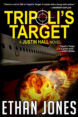
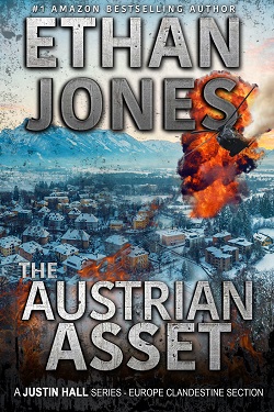
Which one of the two covers below has the better lettering that will entice you to check out the book:
Similar Posts
Check out my poll…
I’ve got a poll going on in my Exclusive Readers’ Group. Check it out here or click…
Target Acquired – Exclusive Preview
Please click below to enjoy an exclusive preview of the first three chapters of Target Acquired: Exclusive…
The Cyprus Coverup ready for Pre-order
The day most of you are waiting for is here. Please pre-order your copy of The Cyprus…
How many people has James Bond killed?
How many people has James Bond killed in all his 24 movies? A. 397 B. 497 C….
The Central Connection for 99 cents? Really?
The Secret Blush reviews are pouring in, but the sales are lagging behind. Why not pick up…
How much of Foreign Interference is true?
How much of Foreign Interference is true? A lot, actually. Australia and China are locked in a…
2 Comments
Comments are closed.
Ethan,
No to silhouette covers no fond of these. The explosions are ok but should be less a part of the illustration. Zoom in or zoom out. On the pic to place a bigger little explosion. Your lettering. Don’t is ok, but one line is more easier to pick out of a crowd.
The yellow attracted my eyes to look at that cover first . They both sound like great books to read can’t wait to read either one. Happy Valentine’s Day to you as well from Canada. KEEP UP THE GREAT writing and thank you for the free book you sent with your email will start reading later today.